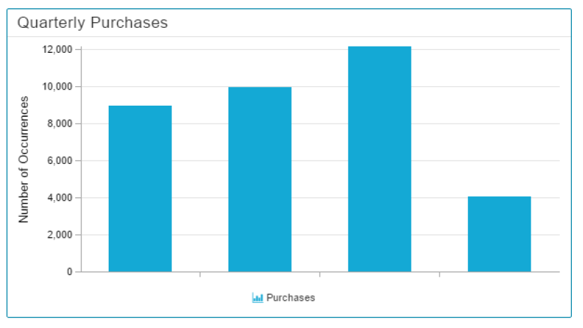
A Histogram visualizes the distribution of a certain dimension, and is very similar to the well known Column Chart.
However, you can group your dimension into data sections, to (for example) filter them for quarterly results.
Configuration
The following configuration tabs are available in the component settings:
Please notice the additional Advanced Settings in the General Component Settings:
To group your Dimension, you can make use of 3 Partition rules: