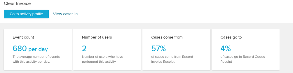
Just as you can get a detailed overview on users, you can analyze activities for their performing users.
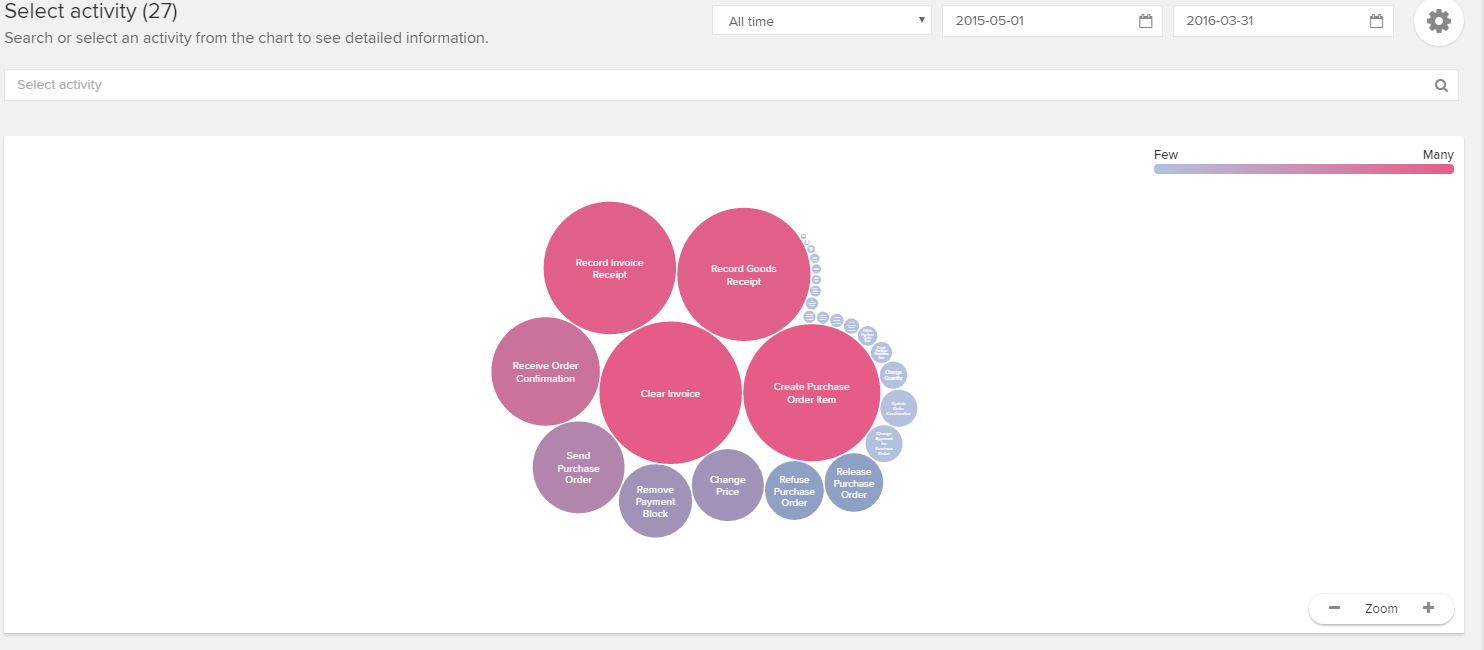
The bubble chart reports on all activities with different colors and sizes, which follow the frequency of their usage.
Click on any activity to access the details: