The following options are available in the General Options section:
| Expand | ||
|---|---|---|
| ||
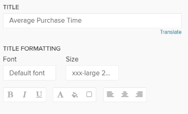
The title will appear above the Single KPI area in your analysis sheet.
Please specify your desired title into the text field.
Next to the text field, a small pencil icon ( This will open the area options, or display the title configuration directly under the text field:
You may edit your font, its size ,text highlighting, colors (font-, background - and border color) and your text orientation.
|

| Expand | ||||||||||||||||||||
|---|---|---|---|---|---|---|---|---|---|---|---|---|---|---|---|---|---|---|---|---|
| ||||||||||||||||||||
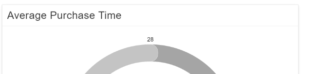
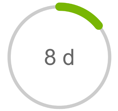
The Single KPI comes with 4 different types, that can be compared to skins.
Choose any type from the dropdown list. Let's examine the types a little further:
|


| Expand | |||||||||||
|---|---|---|---|---|---|---|---|---|---|---|---|
| |||||||||||
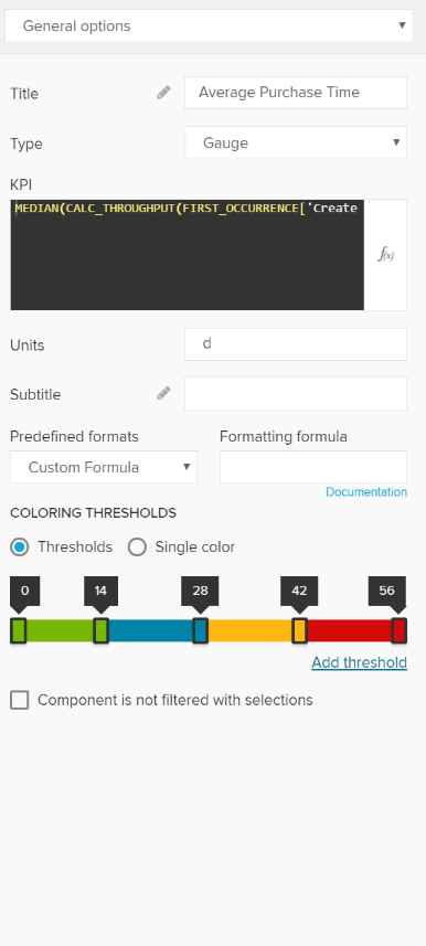
Enter your PQL statement in the KPI section. You can make use of the Formula Editor.
For the sample charts that are shown in the screenshot, the following PQL statement has been created with the formula editor to display the median time (in days) that a case in a Purchase-to-pay process needs from the Creation of a purchase order until the receiption of goods.
|
| Expand | ||
|---|---|---|
| ||
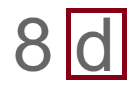
In the Units field you can specify a custom unit, which will be displayed right after the aggregated number of the KPI.
|

| Expand | ||
|---|---|---|
| ||
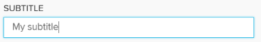
To show a Subtitle under your component, you can use this text field:
Next to the text field, a small pencil icon ( This will carry you on to the Formatting Options
|
| Expand | ||
|---|---|---|
| ||
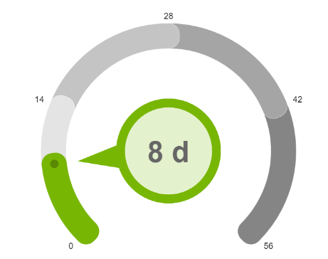
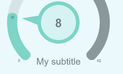
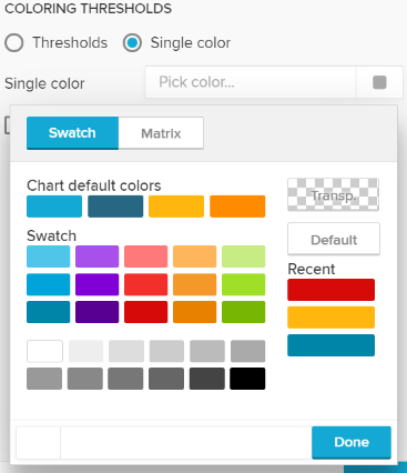
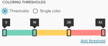
As you can see, Single KPIs work with colors. You can choose between a Single color or use color thresholds, to color your KPI according to a certain value area.
Single Color Select Single Color and choose a color from the color palette. Your whole component will be colored in this color.
Color Threshold Select Threshold to make use of value area coloring.
The displayed numbers are our thresholds. To edit them, click on any marked area in the color stripe:
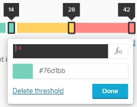
Here, you can assign a threshold as a PQL statement or enter a static number. Entering a PQL statement allows you to color your thresholds in a dynamic matter. Not only your aggregated KPI, but also your thresholds will adopt as soon as changes in the datamodel occur.
Additionally you can use the well known color palette to define a color. This color will be applied to all values that are smaller or equal to the threshold.
To delete your threshold, click on Delete threshold. Don't forget to save your settings with
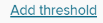
To add a new threshold, use the link next to the color stripe:
Threseholds are sorted automatically in an ascending order.
Please note, that all thresholds that exceed your aggregated KPI will be displayed in different grey colors.
|

| Expand | |||||
|---|---|---|---|---|---|
| |||||
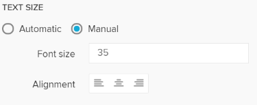
By default, the text size is adapted to the size of the chart area. However, you can set a manual text size by selecting Manual.
Enter your desired Font size and your text-alignment.
If you activated a subtitle, these settings also apply for the subtitle. |
| Expand | ||
|---|---|---|
| ||
If you don't want your component to be affected by any external selection, activate the Component is not filtered with selections checkbox. |