Information given in a Time Series Chart
Just like Line Charts, Time Series Charts can be used to display one or more aggregations by a single dimension (see Figure 2.12). In contrast to Line Charts however, a time dimension should be used since Time Series Charts were especially designed for that purpose. In a Time Series Chart, the x-axis will be formatted dynamically, providing a high level of clarity even for date dimensions in high granularity.
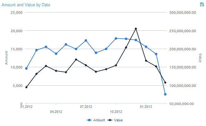
Figure 2.12: Time Series Chart
Interaction with the Time Series Chart
In a Time Series Chart, filtering can be done in two ways. One way is to click on a desired starting point and holding the mouse button pressed down while moving to the desired end point. That way, multiple data points can be selected as filtering basis. Figure 2.13 shows an example of what the chart should look like directly before releasing the mouse button. The other way is to simply click on one of the data points on the lines in the line chart. However, if there is more than one aggregation, clicking on one line in the chart does not mean that only data of this line will be selected in the filter. Rather, by clicking on one data point in any of the lines, the associated data on the x-axis is defined as filtering basis and all points of aggregated data belonging to that data will be selected (e.g. if we click on one of the data points at "January 2013" in Figure 2.13, “January 2013” will be selected as basis for the filter). Once the filter has been applied, the usual “Revert Selection” option will appear on top of the chart and allow you to reverse its effects.
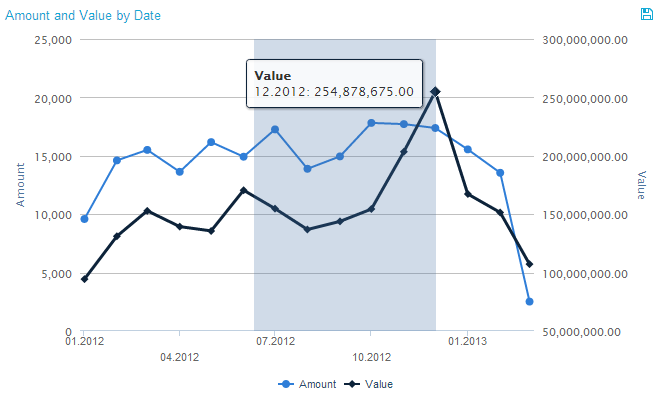
Figure 2.13: Time Series Chart - Filtering
As can be seen in Figure 2.12, a legend at the bottom of the chart shows the different lines of aggregated data. By clicking on one of the legend entries, it is possible to hide single lines from the chart. If a line is in hidden mode, its respective legend entry will be greyed out and the line will not be shown at all. Clicking its legend entry again will make the line reappear.
If export was allowed during the configuration of the Time Series Chart, the data providing the basis for the chart can be exported in View-Mode. In that case, a small disk icon (![]() ) will appear on top of the chart. Clicking on it will lead to a download of the chart’s content as an xlsx file.
) will appear on top of the chart. Clicking on it will lead to a download of the chart’s content as an xlsx file.