In contrast to the Time Series Chart, the Time Series Spline Chart will display the data provided in a spline curve, giving it a smoother look. An example can be seen in Figure 2.14. Since its functionality equals that of the Time Series Chart, please refer to the previous section for further information.
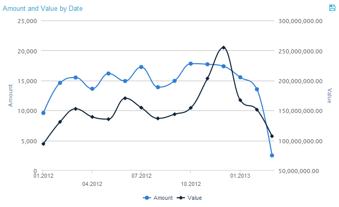
Figure 2.14: Time Series Spline Chart