Just like the Line Chart, the Bar Chart as well is suited for displaying one dimension with various aggregations (see Figure 2.17). The Bar Chart can be used for presenting any kind of data.
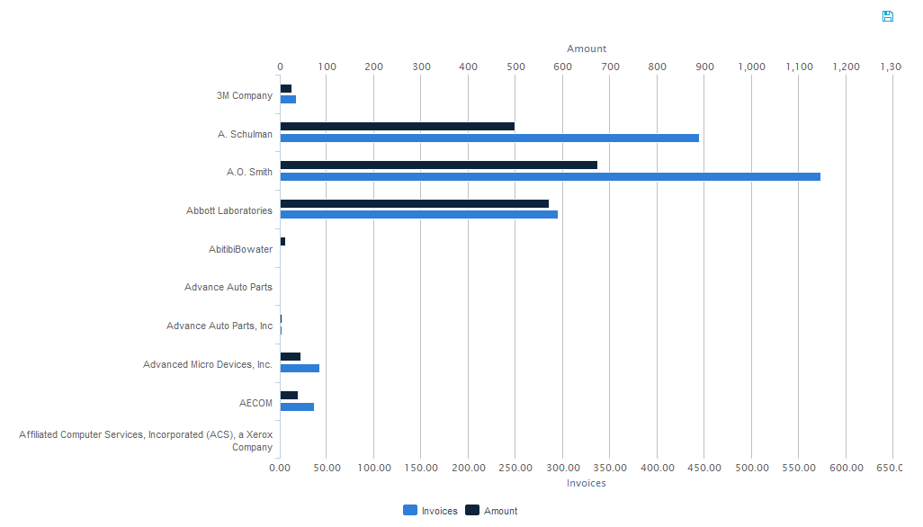
Figure 2.17: The Bar Chart
In a Bar Chart, filtering can be done in two ways. One way is to click on a desired starting point and holding the mouse button pressed down while moving to the desired end point. That way, multiple data points can be selected as filtering basis. The other way is to simply click on one of the bars in the Bar Chart. However, if there is more than one aggregation, clicking on one of the bars does not mean that only this bar will be selected in the filter. Rather, by clicking on one bar, the associated data point on the y-axis is defined as filtering basis and all bars of aggregated data belonging to that data point will be selected (e.g. if we click on one of the bars at “A. Schulman” in Figure 2.17, “A. Schulman” will be selected as basis for the filter). Once the filter has been applied, the usual “Revert Selection” option will appear on top of the chart and allow you to reverse its effects.
As can be seen in Figure 2.17, a legend at the bottom of the chart shows the different bars of aggregated data. By clicking on one of the legend entries, it is possible to hide single bars from the chart. If a bar is in hidden mode, its respective legend entry will be greyed out and the bar will not be shown at all. Clicking its legend entry again will make the bar reappear.
If export was allowed during the configuration of the Bar Chart, the data providing the basis for the chart can be exported in View-Mode. In that case, a small disk icon (![]() ) will appear on top of the chart. Clicking on it will lead to a download of the chart’s content as an xlsx file.
) will appear on top of the chart. Clicking on it will lead to a download of the chart’s content as an xlsx file.