The Pie Chart is well suited for displaying one dimension and one aggregation. Thus it can be used whenever you want to see how little parts of data can be combined to form a big picture, just like the pieces of a pie. An example for a Pie Chart can be seen in Figure 21.
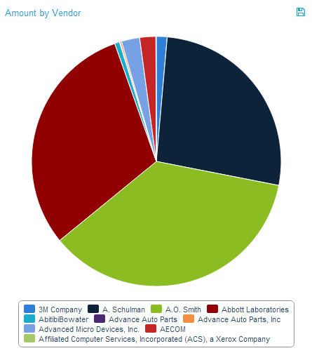
Figue 2.21: Pie Chart
The Pie Chart only provides one way of filtering. By clicking on the single pieces of the Pie Chart, you can select these pieces as basis for your filter. Once the filter has been applied, the usual “Revert Selection” option will appear on top of the chart and allow you to reverse its effects.
As can be seen in Figure 21, a legend at the bottom of the chart shows the different pieces of aggregated data. By clicking on one of the legend entries, it is possible to hide single pieces from the chart. If a piece is in hidden mode, its respective legend entry will be greyed out and the piece will not be shown in the Pie Chart. Moreover, the system will take the hidden piece out of the total amount based on which the size of the pie pieces is calculated, giving the other pieces more space to expand. Figure 2.22 shows an example of a Pie Chart with some hidden pieces. Clicking its legend entry again will make the piece reappear.
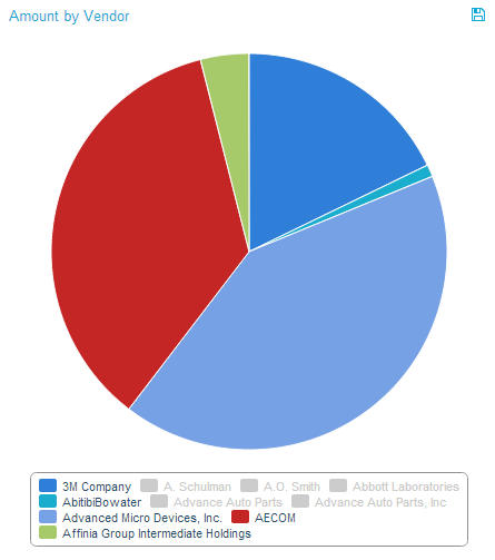
Figure 2.22: Pie Chart - Hidden Pieces
If export was allowed during the configuration of the Pie Chart, the data providing the basis for the chart can be exported in View-Mode. In that case, a small disk icon (![]() ) will appear on top of the chart. Clicking on it will lead to a download of the chart’s content as an xlsx file.
) will appear on top of the chart. Clicking on it will lead to a download of the chart’s content as an xlsx file.