The Donut Chart is very similar to the Pie Chart and slightly different way of visually presenting the data. Instead of as a whole pie, the data will be presented as a “Donut”, a pie with a hole in the middle. An example for a Donut Chart can be seen in Figure 2.23. Since its functionality equals that of the Pie Chart, please refer to the section about the Pie Chart for further information.
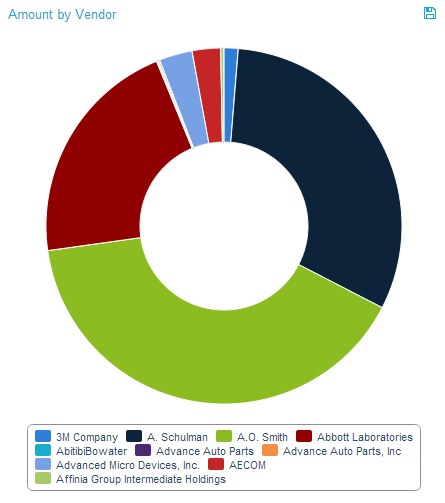
Figure 2.23: Donout Chart