Information given in a Scatter Plot
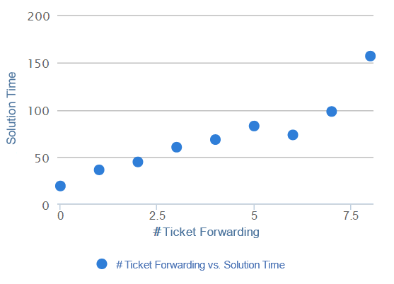
For analyzing correlations between attributes, the Scatter Plot comes in handy. It allows you to choose one or two dimensions and one aggregation whose relationship will be displayed. For instance, Figure 2.24 shows the (positive) correlation between the number of times a ticket has been forwarded and the average solution time of a ticket.
Figure 2.24: Scatter Plot
Another way of using the scatter plot is to choose two or three dimensions but no aggregation. This can be helpful when identifying outliers for example. With two dimensions, this will show a data point for each possible combination of the two dimensions. If there are three dimensions in total (which might include one aggregation), the dimensions on the x-axis and y-axis will be averaged for each value of the third dimension and then displayed in the plot using different colors for each member of the third dimension (e.g. if you are using “Number of Tickets”, “Ticket Forwarding” and “Ticket Category” as dimensions, the number of tickets and the number of times a ticket has been forwarded will be averaged for each ticket category. The average amounts will then be used as coordinates for the data point).
Interaction with the Scatter Plot
On a Scatter Plot it is possible to select an area with the mouse. Here, rather than filtering on the selected data, the system will zoom into the plot, allowing you to take a closer look at the data points selected. Since Scatter Plots often consist of a large number of data points that cannot be distinguished at a normal zoom factor, this function allows for a drill down and thus for greater overview. To revert the zoom, simply click on the "Reset zoom" button appearing in the chart.
As can be seen in Figure 2.24, a legend at the bottom of the chart shows the dimensions of the Scatter Plot. By clicking on one of the legend entries, it is possible to hide single correlations from the chart. However, this only makes sense if there are more than two dimensions involved, otherwise all data points will simply disappear. If a correlation is in hidden mode, its respective legend entry will be greyed out and the correlation will not be shown in the Scatter Plot. Clicking its legend entry again will make the correlation reappear.
If export was allowed during the configuration of the Scatter Plot, the data providing the basis for the chart can be exported in View-Mode. In that case, a small disk icon () will appear on top of the chart. Clicking on it will lead to a download of the chart’s content as an xlsx file.
