Please Note
The following options are only available for charts, that offer linear axis:
Dimension Axis represent the x-axis of your chart.
The following configuration options are available:
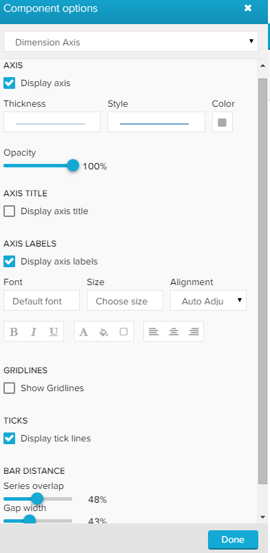
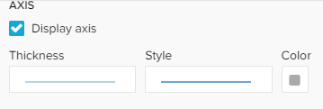
The Display axis checkbox activates the axis, it will be visible next to your chart.

By default, this checkbox is set and your dimension axis is visible. You can now go ahead to configure your axis.
Feel free to alter the style, thickness, color, and opacity of your axis.
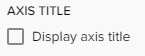
You can label your axis by activating the Display axis title checkbox.
This will display a label next to your axis:
After activating the checkbox, you can enter a title in the Axis title textfield.
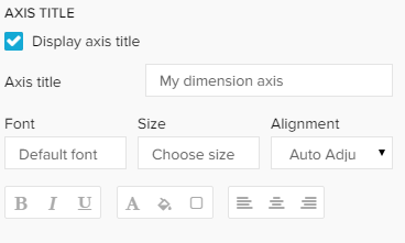
Furthermore, you will find a variety of format options, to adjust your font, its size, highlight, color and alignment.
Axis labels are the units of your axis. To configure the values, please refer to the data series section.
To show axis labels, activate the Display axis labels checkbox, which will introduce you to the following format options:
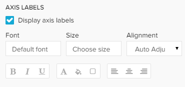
Use these options to alter the label's font, its size, highlight, color and alignment.
All changes will be applied to the whole axis with all included labels.
Dimension axis gridlines are vertical lines that are visible in your graph.
For each axis label (either if they are visible or not, see above), a gridline is displayed after activating the Show Gridlines checkbox.
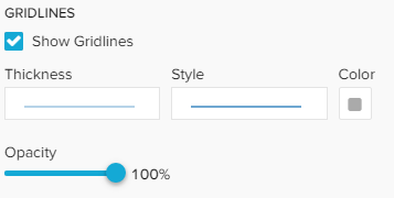
After you activated the gridlines, you can adjust the style, thikness, color and opacity of all lines.
By default, the value axis try to cover all values, starting at 0 (Auto-range).
However, you can focus your graph on a specific range, by activating the Manual-range checkbox:
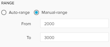
Please note however, that a range only applies for the axis, that you apply this range on.
If you use a secondary value axis, it won't be affected.
Ticks are small, horizontal label lines that are displayed between your value axis and its labels:
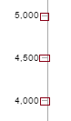
By default, ticks are enabled and thus visible in your graph for all axis.
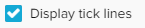
To hide the tick lines, deactivate the Display tick lines checkbox.
By disabeling Auto-tick count you can enter a number. Only this number (if greater than 0) of ticks and labels will be visible on your axis.
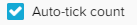
Please note, that this does also affect your gridlines.