This section offers the core functionality of the PI Social.
It introduces a bubble chart with all existing users.
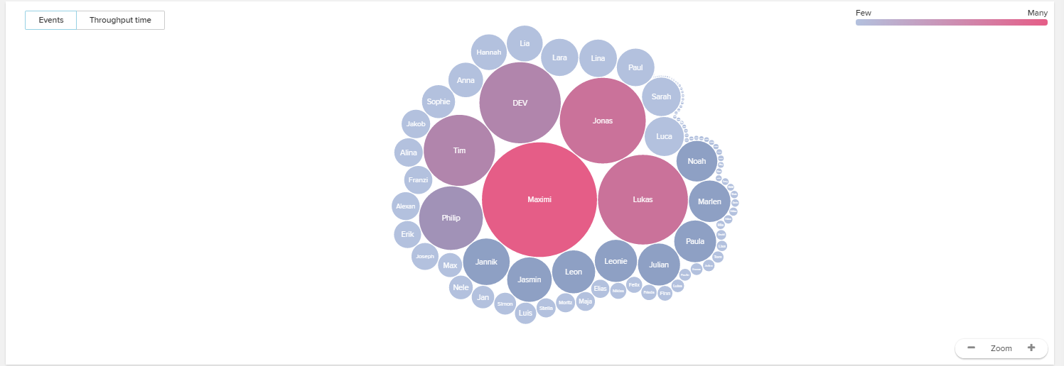
Users are scaled colored differently.
The scaling follows the mean number of events (=activities) that a user performed per day (in the given period of time).
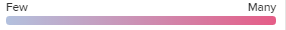
The coloring follows the given legend in the upper right part.
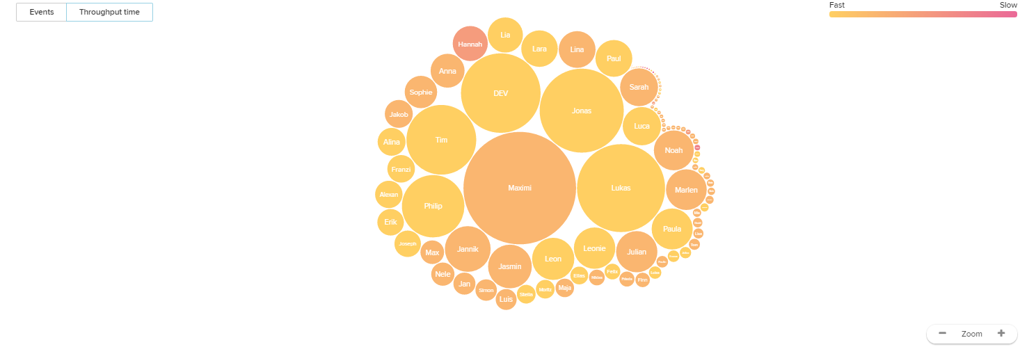
Using the buttons in the upper left corner, you can change the coloring, which can either base on the number of performed events per day, or the throughput time (=the time, that users need to perform activities).
Don't forget about the zoom buttons in the lower right corner.
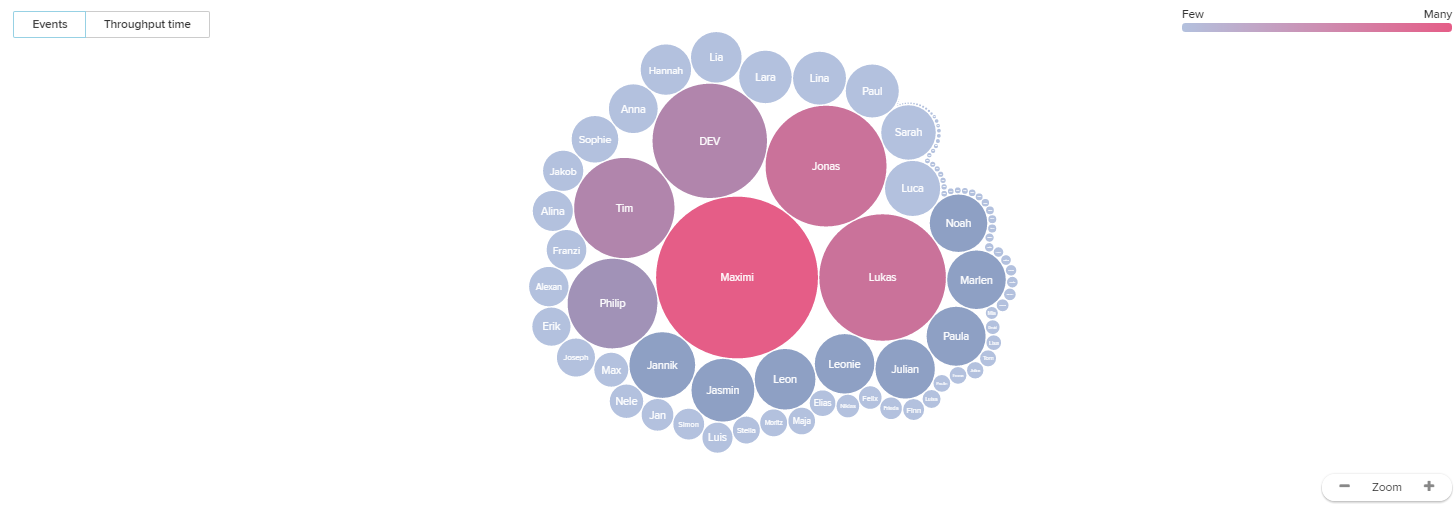
Click on any user to open a quick overview of his profile.
Let's have a look at Jonas:
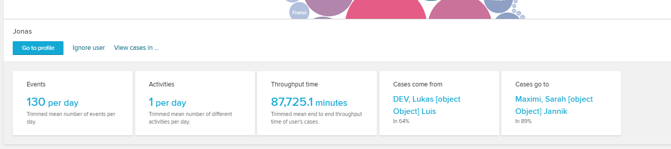
Use the  button to open the user's profile and get a in-depth look on his/her performance.
You can furthermore ignore this user (which will remove him from the bubble chart) or open his/her cases in an analysis sheet (with a global selection for these cases).