In contrast to the components presented in the previous section that are made for visualizing aggregations over various dimensions, the aim of a Value KPI is to illustrate a single aggregation without any dimensions. In the following, the different options available when configuring a Value KPI will be explained.
General Settings
- KPI Type: Choose between “Gauge” and “Text” for your KPI type. When choosing “Gauge”, your KPI will be shown as a tachometer with a predefined value range. “Text” will lead to your KPI being shown as simple text.
- Show KPI name: This option is only available, if you chose “Text” as your KPI type. Decide here, if you want the name of your KPI to be shown in front of the actual KPI, behind it or not at all. The name of the KPI refers to the value you enter into the “Name” field when configuring your aggregation. Showing the name of your KPI can help to make your analyses more intuitively understandable for viewers. For example, if you choose to configure a KPI showing the total number of invoices and assign the name “Total number of invoices” to your aggregation, selecting the option “Before KPI” will show the following in your analysis view: Total number of invoices 12.345 (with 12.345 being an example value).
- Title: This option will only be available if you chose “Gauge” as your KPI type. Select a meaningful title for your gauge component which will be shown directly on top of it. If you do not think a title is necessary, the field can be left empty.
- Range Definition: This option will only be available if you chose “Gauge” as your KPI type. Set here the minimum and maximum value that will define the range of the tachometer.
- Data Source: Select the table you want to display data from. Depending on your choice, the columns available for choosing your aggregation will vary. The selection of tables available as your data source depends on the data cube you chose when creating your analysis document. Only tables contained in the cube can be selected.
- Selection Application Although the dynamic adaptation of all analysis components to a filtering selection made is one of the most powerful features in SAP Process Mining by Celonis , sometimes you might want to exclude single components from adapting to filters. By activating “Don’t apply selection to this component”, the component will become insensible to selections made within other components. However, by default “Apply selection to this component” will be enabled to allow the component to adapt to dynamic filtering.
Adding an Aggregation
An Aggregation can be added by simply clicking on the + symbol next to the column name. After adding an aggregation, you will see it in the list of aggregations on the right side of the aggregation selection field. Each list entry contains the column name the aggregation is based on, the first few letters of the field formula as well as two symbols for configuring and deleting the aggregation. If you click on the name or formula of the aggregation, an input field will appear allowing you to edit the respective field. The name and formula of an aggregation can also be changed in the aggregation settings which will be explained later in this section.
Apart from the field “Count”, whenever you choose an aggregation, you will have to select one of the four aggregation functions that is to be performed on the column selected. These four functions are “Sum”, “Average”, “Minimum” or “Maximum”. “Sum” will lead to the column entries being accumulated. “Average” will give back the average value of the column entries and “Minimum” and “Maximum” will lead to the minimum or maximum value of all column entries being chosen respectively. To learn more about Aggregations, please refer to Charts and Tables.
When choosing “Count”, no aggregation function needs to be selected. That is because “Count” simply counts the number of column entries for each occurrence.
You can also define your own aggregations based on PQL Syntax by adding an arbitrary column, e.g. “Count” and then entering any PQL based formula in the Formula field. How to edit the Formula field will be explained later in this Section.
Editing an Aggregation
Once you have added an aggregation, it will appear in a list on the right side of the aggregation selection field. After clicking on the small screwdriver icon, you will be forwarded to the edit menu. The following sections will explain the settings that can be made within that menu. The configuration menu is the same as the one for editing the dimensions and aggregations of Charts and Tables. Therefore, some of the options are not relevant for configuring KPI aggregations. This chapter will only focus on the options relevant for configuring a KPI aggregation. For a full description of all available options, please refer to "Charts and Tables (Analysis View)".
Name and Formula
- Name: Enter here a meaningful name for your aggregation. If you chose “Text” as your KPI type and enabled the option “Show KPI name”, the entry in this field will be shown either before or after your KPI (depending on your choice). For “Gauge” KPI types, the entry of this field will be shown when hovering over the tachometer needle.
- Formula: This field usually stays unchanged. However, advanced users can define their own aggregations via PQL Syntax. All PQL functions can be used in this field, making it a very powerful instrument to adapt components to individual needs.
Font and Format
Font
- Font Color: Choose the color of the font either by using the color picker appearing once you click into the input field or by typing the labels of common colors such as “black”, “white”, “red”, “blue”, “green” and “yellow.
- Font Size: Specify the size of the font.
- Font Weight: Choose between normal or bold weight. Bold weight will affect the width of the font stroke and put emphasis to its content.
Format
- Number Format: Here you can specify the format of the data values. The drop down menu contains a number of predefined formats to choose from. However, formats can manually be adjusted in the Format Code field right next to the dropdown menu.
- Format Code: Here, formats for data values will appear if you choose a predefined number format. You can also adjust formats manually by using the formatting options for numbers and dates described in Chapter 3.4.
Table Appearance
- Background: This option only has an effect on “Text” type KPIs. If desired you can choose a background color for your KPI. Choose either by using the color picker appearing when clicking into the input field or by typing common color labels such as “black”, “white”, “red”, “blue”, “green” and “yellow”.
Add, Edit and Delete Bands
Adding, editing and deleting of bands is only available if chose “Gauge” as your KPI type. These options allow you to define different sections within your tachometer and apply different colors to them. This can help to make your analysis more intuitively understandable. If you define green, orange and red areas for example, you will immediately be able to see, whether the value of your KPI is normal or critical. Figure 3.15 shows an example of a gauge chart with three differently colored bands.
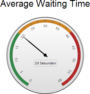
Figure 3.15: Gauge Chart with three Bands
Add a Band
To add a Band, simply click on the small "Add Band" button appearing on top of the (initially empty) band list. After adding a band, an entry will appear in the list below and you will be able to edit the configuration options.
Edit a Band
- Band Name: Clicking on the current name of your Band will make an input text field appear, enabling you to update its name. The name of the Band is only for your orientation and will not be shown in your analysis. Don’t forget to click on “Update” after making your changes.
- Band Color: Assign a color to your band. The color will be shown on the outer rim of the tachometer (as can be seen in Figure 3.15). Choose either by using the color picker appearing when clicking into the input field or by typing common color labels such as “black”, “white”, “red”, “blue”, “green” and “yellow”. Don’t forget to click on “Update” after making your changes.
- Band Size (%): Define the range of the Band. Please note that the value you enter here will specify up to which percentage the Band will reach. For example if you have one Band with 33% Band Size, it will take up 33% of the tachometer rim. If you now want to add another Band, its size should be larger than 33% (make it 66% for filling the next third of your tachometer’s rim). The last Band you add should go up to 100%. Don’t forget to click on “Update” after making your changes.
Delete a Band
To delete on of the Bands, mark the respective entry in your Band list and click on the small "Delete Band" button on top of it.
Managing the Band list
If you hover over one of the heads of the columns within the Band list, a small arrow pointing down will appear next to it. Clicking on it will give you the option to sort your entries in the Band list in ascending or descending order. Also, you can choose which columns you want to display and which ones you want to hide from the list.
Filters
In the lower right corner of the Chart Configuration menu you will find the Filters button.
The Filters button is available in most components and gives you the possibility to define a filter that will be applied only to this component. If you apply a filter, only the data conforming to the filter criteria will be chosen as basis for the component. For the definition, any statement made in PQL Syntax can be used.