Once you have chosen the option „Chart/Table“ shown in the top row of Creating an Analysis, the Chart Configuration screen as shown in Figure 3.11 will appear. The following sections will explain the different options available when configuring a chart or table.
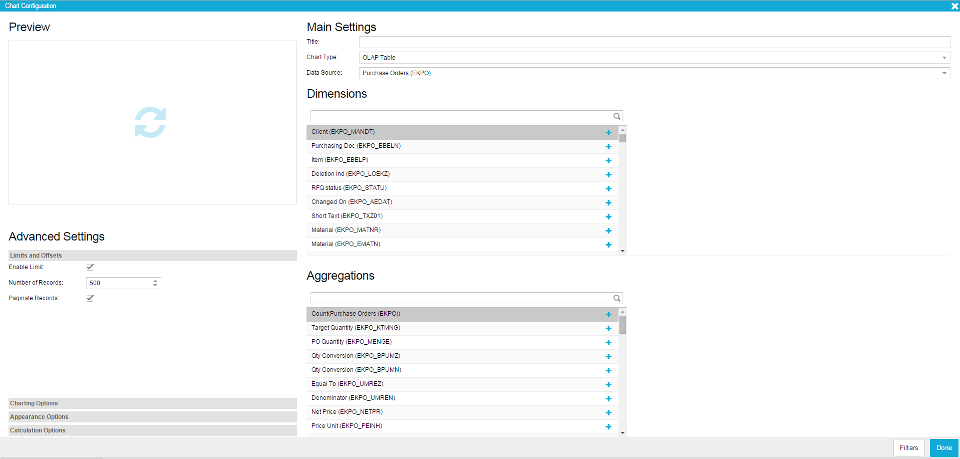
Figure 3.11: Charts and Tables - Sample Configuration
Preview
The preview slot is the most easily understandable part of the configuration screen. While configuring your component, simply click on the slot to see what your current component looks like. That way you can easily try different forms of presentation for your data and select the one most suitable for your purposes. Since the preview slot does not update automatically, you need to click on it every time you want changes to appear.
Main Settings
In the Main Settings you can specify a title for your component as well as the chart type and data source used for it.
- Title: Use a meaningful title for your component, which will be shown directly on top of it. If you do not think a title is necessary, the field can be left empty.
- Chart Type: Here you can choose from the broad variety of available chart and table types to ensure the best possible presentation of your data. Information about the different charts and tables available can be found in Chapter 2.3.3. The chart type can be changed at any time during the configuration, allowing you to try different types and get a first impression in the Preview field.
- Data Source: When creating an analysis, a data cube has to be selected which normally contains a variety of different tables. In the Data Source field, you can choose which one of these tables should be used as a basis for your current dimension or aggregation. Since the data source will be defined individually for each dimension or aggregation, it is possible to mix data from different sources in one chart.
Advanved Settings
Limits and Offsets
- Enable Limit: Activate this option if you want to enable the setting of a limit to your data. The result set will then be limited to the number of records specified in the field below. Please note that the selection of the data will depend on your sorting settings. Therefore, in case you want to retrieve the most frequent X entries, make sure you have set the sorting of your aggregation to descending and the sorting for your dimensions to none. Information about how to set sorting options will be given later in this Section.
- Number of Records: Specify here the number of records you want to limit your result set to. This does only cause an effect if the “Enable Limit” checkbox is activated.
- Paginate Records: This option only causes an effect for OLAP tables. If the result set of your table is big you can use it to distribute results across different pages. Once you have scrolled to the end of the table and more data is available, a bar will appear enabling you to load more data on request.
Charting Options
- Stack Series: If activated, all aggregations will be shown stacked (for Line Charts, Spline Charts, Bar Charts, Column Charts, Area Charts and Area Spline Charts). Please note that this option only makes sense if the aggregations have the same range of values.
- Stack Percentages: If activated, all aggregations will be shown transferred to percentage values and shown stacked (for Line Charts, Spline Charts, Bar Charts, Column Charts, Area Charts and Area Spline Charts).
- Data Point Labels: Checking this box will make labels appear that show information about the value of the aggregation selected. This only causes an effect in Bar and Column Charts. Please keep in mind that depending on the individual chart configuration, if a high number of aggregations was selected, the labels might not be (completely) visible. An example for the use of labels can be seen in Figure 3.12.
- No Series Padding: This option is only available for the Bar and Column Chart and will affect the space in between the single bars or columns. If the option is activated, the spaces will be removed and the bars or columns will be shown without padding.
- Show Legend: If activated a legend will be shown below the component containing an entry for each aggregation. By clicking on the single entries, data series can be hidden or made visible again.
- Show Tooltip: If this option was activated, a small label will appear every time you hover your mouse over one of the data series in the chart. The label contains information about the values of the dimensions and aggregations for the respective data point. The tooltip should be switched on, when a large amount of data is displayed and values for each data point cannot easily be identified (for example if a Pie Chart is used and the single pieces are very small).
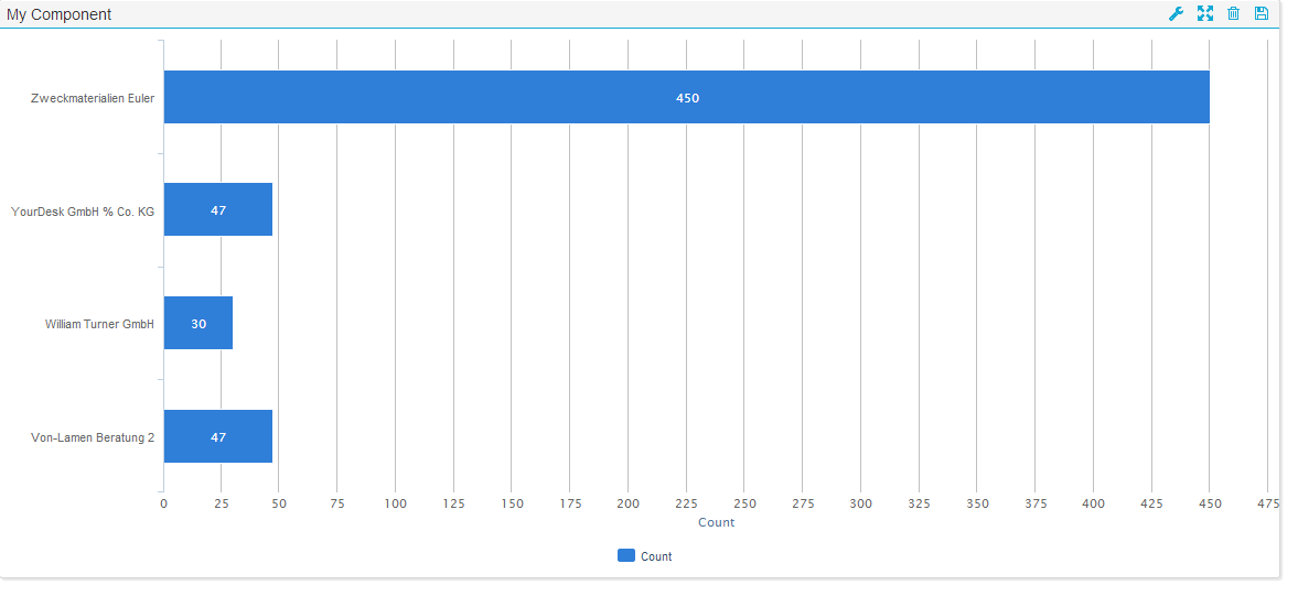
Figure 3.12: Chart with Labels, Border and Tool Border
Appearance Options
- Show Border: After enabling this box, a subtle border and shadow will be shown around the component, giving it a more elaborated look. [Figure 45](#Fig45) provides an example for the use of a border around the chart.
- Show Tool Border: After enabling this box, a subtle line will be shown between the actual chart and the header of the chart, containing its title and editing options. In Figure 3.12 an example for the use of the tool border is shown.
- Background: Here you can choose a background color for the component. When clicking into the input field, a color picker will appear. Standard colors like “black”, “red”, “blue”, “yellow” and “green” can also be defined via text input (please note that for OLAP tables you will have to define the background color directly in the dimensions or aggregations settings described later in this Section).
- Dynamic Column Selection: This option only causes an effect for OLAP Tables. If it is activated, viewers of the analyses will be able to dynamically hide and show columns included in the OLAP Table (as described in Charts and Tables).
- Allow Export: If export is allowed, viewers of the analysis will be able to save and download the data used as a basis for the chart in an xlsx file format.
Calculation Options
- Filter self by Selection: Normally when you choose a data point within a component as your basis for dynamic filtering, the filter will also be applied to the component containing the data point. Activating this box will force the component to stay the same when a dynamic filter is applied to it while all other components in the analysis will still be filtered according to the selection made.
- Distinct: This option will only have an effect on OLAP Tables that do not include aggregations but only dimensions. Without aggregations, it can happen that OLAP Tables show several rows with exactly the same entries. Choosing “Distinct” will lead to these rows being consolidated into one. Each row will then show different values, thereby heightening the significance of the table.
- Apply selection to this component:If this option is activated, the component will react to any dynamic filtering done within another component and adapt to the filtering basis selected. Since this option is the prerequisite for the powerful dynamic filtering to work, it will be enabled by default.
- Don’t apply selection to this component: Although the dynamic adaptation of all analysis components to a filtering selection made is one of the most powerful features in SAP Process Mining by Celonis , sometimes you might want to exclude single components from adapting to filters. By activating this option, the component will become insensible to selections made within other components. It will also become insensible to selections made within itself (just as if the “Filter self by Selection” option was switched off).
Dimensions and Aggregations
Your selection of dimensions and aggregations defines the data basis for the analysis component. Which dimensions or aggregations are available depends on the data source you selected in the Main Settings.
Dimensions
Dimensions basically represent the columns of the table you selected as data source in the Main Settings. In contrast to aggregations, there are no restrictions as to which data types can serve as dimensions therefore all columns available in the table can be selected. Your choice of a dimension will define the possible level of aggregation for your data. If, for example, you add a dimension containing dates and want to round all dates to month, there will be a maximum of twelve possible aggregations for one year. However, if you round the dimension to years, there will – for one year – only be one entry with one aggregation in your analysis component.
Aggregations
Aggregations are functions that consolidate a set of values belonging to a single occurrence inside a dimension into one single value. Consolidation can be done by accumulating the values, by calculating the average, minimum or maximum or simply by counting the number of occurrences. To give a short example let’s assume your data cube contains a table listing all invoices you received from vendors and their respective order values. Now if you choose “vendor” as dimension and the sum of “order value” as aggregation, for each vendor all entries in your data cube will be accumulated regarding their order values. Your result set will contain one entry for each vendor and his respective sum of order values. If you choose “avg” as aggregation function, the average of the order values will be calculated for each vendor. If you choose “min” or “max”, the minimum or maximum order value will be selected and presented in the result set.
Apart from the function “count” all aggregation functions (“sum”, “avg”, “min” and “max”) need to be based on another column than the dimension column. Since these functions can only be performed on numerical data, only columns containing numerical data types will be available for selection. Basically, the table selected as data source will be scanned for numerical data types and all columns meeting the criteria will be provided as bases for aggregations.
The function “count” simply counts the number of occurrences for each value in the dimensions column (so for our vendor example, the result set would contain an entry for each vendor and the number of invoices you received from him).
If you use aggregations with two or more dimensions aggregations will be calculated for each unique combination of all dimension values occurring in the data source.
Number of possible dimensions and aggregations depending on Chart Type
Depending on the Chart Type you selected in the Main Settings, the number of possible dimensions and aggregations will vary (please see the following table).
| Chart Type | #Dimensions | #Aggregations |
|---|---|---|
| OLAP Table | ∞ | ∞ |
| Time Series Chart | 1 | ∞ |
| Time Series Spline Chart | 1 | ∞ |
| Line Chart | 1 | ∞ |
| Spline Chart | 1 | ∞ |
| Bar Chart | 1 | ∞ |
| Column Chart | 1 | ∞ |
| Area Chart | 1 | ∞ |
| Area Spline Chart | 1 | ∞ |
| Pie Chart | 1 | 1 |
| Donut Chart | 1 | 1 |
| Scatter Plot | 1 or 2 | 1 or 0 |
| Bubble Plot | 1 | 2 |
| Spider Web Chart | 1 | ∞ |
Table 1: Dimensions and Aggregations of Chart Types
Adding a Dimension
A Dimension can be added by simply clicking on the + symbol next to the column name. After adding a dimension, you will see it in the list of dimensions on the right side of the dimension selection field. Each list entry contains the name of the dimension, the first few letters of the field formula as well as two symbols for configuring and deleting the dimension. If you click on the name or formula of the dimension, an input field will appear allowing you to edit the respective field. The name and formula of a dimension can also be changed in the dimension settings which will be explained later in this Section.
Whenever you choose to add a date field, you will be asked if you want to show the data without grouping, if you want to round on one of the date components (year, month, day, hour, minute, second) or if you want to extract one of the components. For example, rounding a date like “2014-01-01 23:59:59” on month will result in “2014-01” whereas extract month will only result in “01”.
Adding an Aggregation
An Aggregation can be added by simply clicking on the + symbol next to the column name. After adding an aggregation, you will see it in the list of aggregations on the right side of the aggregation selection field. Each list entry contains the column name the aggregation is based on, the first few letters of the field formula as well as two symbols for configuring and deleting the aggregation. If you click on the name or formula of the aggregation, an input field will appear allowing you to edit the respective field. The name and formula of an aggregation can also be changed in the aggregation settings which will be explained later in this section.
Apart from the field “Count”, whenever you choose an aggregation, you will have to select one of the four aggregation functions that is to be performed on the column selected. These four functions are “Sum”, “Average”, “Minimum” or “Maximum”. “Sum” will lead to the column entries being accumulated. “Average” will give back the average value of the column entries and “Minimum” and “Maximum” will lead to the minimum or maximum value of all column entries being chosen respectively. To learn more about Aggregations, please refer to the previous section “General Information on Dimensions and Aggregations”.
When choosing “Count”, no aggregation function needs to be selected. That is because “Count” simply counts the number of column entries for each occurrence.
You can also define your own aggregations based on PQL Syntax by adding an arbitrary column, e.g. “Count” and then entering any PQL based formula in the Formula field. How to edit the Formula field will be explained later in this Section.
Edit, Delete or change Order of a Dimension or Aggregation
Once you have added a dimension or aggregation, it will be shown in the configuration menu as can be seen in Figure 3.13.
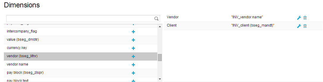
Figure 3.13: Dimension in Dimension List
- Edit: To edit the settings of a specific dimension or aggregation, click on the screwdriver icon appearing next to it (see Figure 3.13). You will be forwarded to the edit menu which will be explained later in this Section.
- Delete: To delete a dimension or aggregation from your selection, click on the small rubbish bin icon appearing next to it (see Figure 3.13).
- Change Order: To change the order of dimensions or aggregations, simply click on the respective list entry and drag-and-drop it to the desired spot.
Edit Dimensions and Aggregations
Once you have added dimensions and aggregations to the chart, they will appear in a list as shown in Figure 3.14. After clicking on the small screwdriver icon, you will be forwarded to the edit menu. The following sections will explain the settings that can be made within that menu.
Name, Formula and Sorting
- Name: If you chose a Chart Type with axes, such as Line Charts, this name will be shown on the corresponding axis. In general, it is recommended to assign meaningful names making it easy for users to understand the content of the chart.
- Formula: This field usually stays unchanged, especially for dimensions. However, advanced users can define their own aggregations via PQL syntax. All PQL functions can be used in this field, making it a very powerful instrument to adapt components to individual needs.
- Sorting: Here you can define if sorting should be used at all and whether it should be ascending or descending. Sorting will be done according to numerical order for numerical data types, chronological order for date types and alphabet for strings. Please note that only one dimension or aggregation can be considered for sorting, so assigning sorting to several columns does not make sense. Sorting is especially important for components showing the top x results of a certain aggregation.
Font, Format, Layout and Other
All font and format configurations are only relevant when an OLAP Table is used. Configurations will influence the appearance of the table entries inside the columns.
Font
- Font Color: Choose the color of the font either by using the color picker appearing once you click into the input field or by typing the labels of common colors such as “black”, “white”, “red”, “blue”, “green” and “yellow.
- Font Size: Specify the size of the font.
- Font Weight: Choose between normal or bold weight. Bold weight will affect the width of the font stroke and put emphasis to its content.
- Alignment: Choose between left, right and center to align the font either to the right side, the left side or the center of the column.
Format
- Number Format: Here you can specify the format of the data values. The drop down menu contains a number of predefined formats to choose from. However, formats can manually be adjusted in the Format Code field right next to the dropdown menu.
- Format Code: Here, formats for data values will appear if you choose a predefined number format. You can also adjust formats manually by using the formatting options for numbers and dates.
Layout
- Header Alignment: Choose between left, right and center to specify if the text inside the column head should be aligned to the left side, the right side or the center of the column.
Other
- Searchable: Activating this option will make it possible to search through dimension columns for string expressions or parts of string expressions. Searching can be done by hovering over the head of the columns and clicking on the magnifying glass icon (as described in Chapter 2.3.3).
Axis Configuration
- Show Axis Title: If the option is activated, the column name as specified in the name field will appear next to the chart axis. This will only cause an effect if the chart type makes use of an axis (e.g. Line Chart or Area Chart).
- Axis Range: Set a minimum value, maximum value or an interval to put limits to use only parts of the underlying data instead of the whole data set.
- Axis Position: Choose whether the axis for an aggregation should be displayed on the right side or the left side of the chart or not at all. If two aggregations are used within one chart, one axis can be displayed on the left and the other one on the right side thus providing a clearer presentation of the data.
Chart Appearance
- Line Color: Line Color only has an effect on charts using lines for data presentation (e.g. Line Charts or Area Charts). Here, the color of the line can be specified either by using the color picker appearing when clicking into the input field or by typing common color labels such as “black”, “white”, “red”, “blue”, “green” and “yellow.
- Fill Color: Fill Color only has an effect on Bar and Column Charts. Here, the color of the bar or column can be specified either by using the color picker appearing when clicking into the input field or by typing common color labels such as “black”, “white”, “red”, “blue”, “green” and “yellow".
- Line Width: Line Width only has an effect on charts using lines for data presentation (e.g. Line Charts or Area Charts). Define the width of the line by typing in an arbitrary positive number.
- Markers: Only relevant for Time Series Charts, Line Charts and Area Charts. If checked, the single data points will not be shown in the chart but only the curves.
- Alt. Type: This option allows to choose an alternative chart type so different aggregations can be presented using different types within the same component. For this option to work, you need to enable the “Use Alt. Type” checkbox next to it. An example for different chart types in one component is given in Figure 3.14.
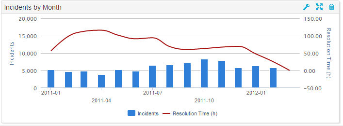
Figure 3.14: Alternative Chart Types within one Component - Use Alt. Type: This option needs to be activated in order to be able to use alternative chart types for each aggregation within one analysis component (as displayed in Figure 3.14). Once the option is activated, an alternative chart type can be chosen in the dropdown list next to the checkbox.
Table Appearance
- Background: If desired you can choose a background color for your table. Choose either by using the color picker appearing when clicking into the input field or by typing common color labels such as “black”, “white”, “red”, “blue”, “green” and “yellow. This option only causes an effect for OLAP Tables. For all other charts, a background color can be specified in the Appearance Options.
- Flex: This option only causes an effect for OLAP Tables. Define the column width for dimensions and aggregations relative to the other columns used in the table. For example, if Flex = 2, the column will be displayed twice as wide as columns with Flex = 1.
Filters
In the lower right corner of the Chart Configuration menu you will find the Filters button.
The Filters button is available in most components and gives you the possibility to define a filter that will be applied only to this component. If you apply a filter, only the data conforming to the filter criteria will be chosen as basis for the component. For the definition, any statement made in PQL Syntax can be used.