A data series section is set up for every dimension and KPI that has been created in your component (also see general options).

It offers options that are available in the Formula Editor.


The Data Series configurations differ a lot for different components.

For this reason, we strongly recomment to conduct the component's chapter, to know which options are available and relevant for a successful configuration.
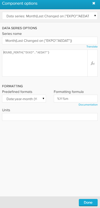
 

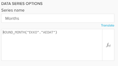
This screenshot shows the Data Series options that are available for all components.


At the top of this section, you may change the Series name. This is the name that is displayed in the dimension section, the KPI section and the sorting section in the general options.


Furthermore, you can alter the KPI statement. Click on the small icon () on the right corner to edit the statement in the Formula Editor.
Please refer to the Dimensions & KPIs chapter for further explanations.


In this section, you can alter your Value Formatting.


The following option is only available for OLAP Tables:


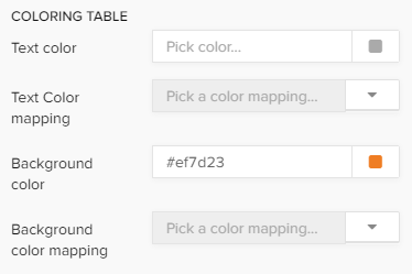
You can color the content of the table, as well as the background.


For both, you can either select a single color or apply a color mapping rule.

If you wish to color the table's content or the background in the same color, pick a color in the Text color or the Background color field.


If you wish to insert a custom css color, you can use the field in the lower row.

This method allows text - or background coloring according to different criteria.

For example, critical values can be highlited with a different color.

Click on the small icon to get started!


To add a new color mapping, click on in the upper right corner.


The following color mapping editor will open:

First, let's give our new color mapping a title in the upper text-field.


You can furthermore choose coloring based on values of Dimensions or Series (which is selected by default).

Dimension color rules will be applied on the dimensions, Series color rules will be applied to the KPIs.


We need to define color thresholds.

For each threshold we can specify a comparison function as well as the actual threshold value.


Let's examine the following example:

We want to color all materials which occur at least 2000 times blue, all materials occuring less than 200 times but more than 1000 times yellow, and all other materials (less than 1000) in black.

The following threshold settings need to be made:


SAP Process Mining by Celonis 4.2 prioritizes color threshold settings which have been added recently.

To prevent any coloring overlaps, we strongly recommend to start with the lowest number of cases.


The following options are only available for charts, that offer linear axis:


You can display this data series either in your primary value axis or in your secondary value axis with the Axis dropdown menu.


Please note, that this section is only available for KPIs, as dimensions are displayed in the x-axis.


Please note, that this section is only available for KPIs, as dimensions are displayed in the x-axis.


 You can color the graph (series color) with the following options:


You can choose between a (single) series color, a series palette and a color mapping.

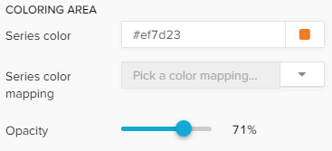
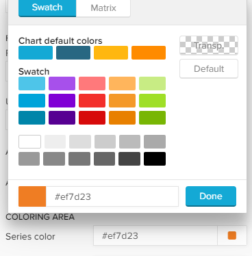
If you wish to color your graph in one single color, pick a color in the series color field.


If you wish to insert a custom css color, you can use the field in the lower row.

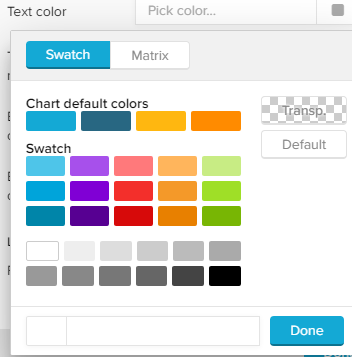
You can use a palette to color your graph in different colors.

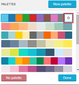
SAP Process Mining by Celonis 4.2 comes with a set of pre-defined palettes, which can be accessed with the small icon next to the series palette field.


Choose any palette and click on Done, or choose New palette to define a custom palette.

The palette editor will show up:


Click on to add up to 20 colors!


You can edit each color by clicking on the small colored square next to each color:


You can furthermore add a linear gradient to your palette. This will split your selected colors up into 20 gradient colors, which fade linear between two colors.


Don't forget to apply your palette with .

Your new palette has now been added, and can be edited with the small icon next to your custom palette:


While editing a palette, you can delete it by clicking on .


This method allows (multiple) coloring according to different criteria.

For example, critical values can be highlited with a different color.

Click on the small icon to get started!


To add a new color mapping, click on in the upper right corner.


The following color mapping editor will open:

First, let's give our new color mapping a title in the upper text-field.


You can furthermore choose coloring based on values of Dimensions or Series (which is selected by default).

Dimension color rules will be applied on the dimensions, Series color rules will be applied to the KPIs.


We need to define color thresholds.

For each threshold we can specify a comparison function as well as the actual threshold value.


Let's examine the following example:

In a P2P process, we want to color all materials which occur at least 2000 times blue, all materials occuring less than 200 times but more than 1000 times yellow, and all other materials (less than 1000) in black.

The following threshold settings need to be made:


SAP Process Mining by Celonis 4.2 prioritizes color threshold settings which have been added recently.

To prevent any coloring overlaps, we strongly recommend to start with the lowest number of cases.


To adjust the opacity of (any) color rule, you can use the opacity slider:


Please note, that this section is only available for KPIs.

To display the value of the data series above the bars in your graph, you can activate data labels with the checkbox display data labels.


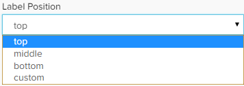
After activating the checkbox, you can adjust the position of the data labels with the dropdown - menu:


Furthermore, you can format the labels with the known formatting options (font, size, alignment, highlight, color).


The following options are only available for the following charts:


Please note, that this section is only available for KPIs, as they determine the relation of the chart entries.


 You can color your chart (series color) with the following options:

You can choose between a (static) series palette and a color mapping.


You can use a palette to color your graph in different colors.

SAP Process Mining by Celonis 4.2 comes with a set of pre-defined palettes, which can be accessed with the small icon next to the series palette field.


Choose any palette and click on Done, or choose New palette to define a custom palette.

The palette editor will show up:


Click on to add up to 20 colors!


You can edit each color by clicking on the small colored square next to each color:


You can furthermore add a linear gradient to your palette. This will split your selected colors up into 20 gradient colors, which fade linear between two colors.


Don't forget to apply your palette with .

Your new palette has now been added, and can be edited with the small icon next to your custom palette:


While editing a palette, you can delete it by clicking on .


This method allows (multiple) coloring according to different criteria.

For example, critical values can be highlited with a different color.

Click on the small icon to get started!


To add a new color mapping, click on in the upper right corner.


The following color mapping editor will open:

First, let's give our new color mapping a title in the upper text-field.


You can furthermore choose coloring based on values of Dimensions or Series (which is selected by default).

Dimension color rules will be applied on the dimensions, Series color rules will be applied to the KPIs.


We need to define color thresholds.

For each threshold we can specify a comparison function as well as the actual threshold value.


Let's examine the following example:

In a P2P process, we want to color all materials which occur at least 2000 times blue, all materials occuring less than 200 times but more than 1000 times yellow, and all other materials (less than 1000) in black.

The following threshold settings need to be made:


SAP Process Mining by Celonis 4.2 prioritizes color threshold settings which have been added recently.

To prevent any coloring overlaps, we strongly recommend to start with the lowest number of cases.


To adjust the opacity of (any) color rule, you can use the opacity slider:


The following, additional options are available:


Activate this option to display value labels in your chart area.


This option requires visible labels!

If you displayed a lot of entries in your chart area, you might only be interested in value labels for all entries above a certain threshold.

With this option, you can set such a threshold.


Activate the Set count limit checkbox and enter your desired threshold in the text field:

In this example, labels will only be shown if their kpis are greater then the count limit. According to your kpi settings, 3 might also refer to "3.000".

Activate this option to display the relative share of each entry (%) in your chart area.