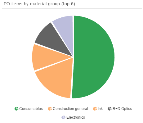
A pie chart illustrates numerical proportions of the underlying data in the well-known circle.
The dimensions can be columns or aggregations and the KPIs are typically frequencies or distributions.
You can find all available configuration options in the following chapters.
| Tip | ||
|---|---|---|
| ||
The displayed configuration in the following chapters matches the sample chart that is displayed above. You can easily re-build it with these options and apply your own data. |
- Title Settings
- Dimensions & KPIs
- Sorting
- Advanced Settings
- Title Settings
- Title Formatting
- Border Options
- Background Options
- Legend Settings & Formatting
- Series Settings
- Formatting
- Other Options