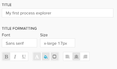
Title: In the first section a title can be added to the component by typing your desired title into the text field. When a title is set, its formatting option will be shown directly as the next settings and font, size, color and alignment can be defined.
Border: With a checkbox a border for the component can be applied. Afterwards the border thickness, style, color and opacity can be adjusted.
Background: With a checkbox a background for the component can be applied. The color and opacity can be adjusted in the appearing settings.
Shape type: You can choose between hexagon, circle and square representations of your activity nodes.
| Expand | ||
|---|---|---|
| ||
Type your desired title into the text field. When a title is set, its formatting option will be shown directly as the next settings and font, size, color and alignment can be defined.
|
...