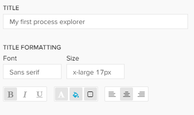
Title: In the first section a title can be added to the component by typing your desired title into the text field. When a title is set, its formatting option will be shown directly as the next settings and font, size, color and alignment can be defined.
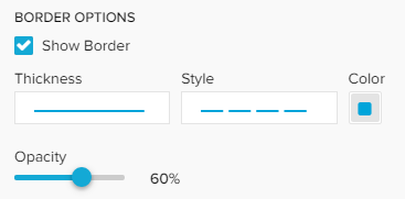
Border: With a checkbox a border for the component can be applied. Afterwards the border thickness, style, color and opacity can be adjusted.
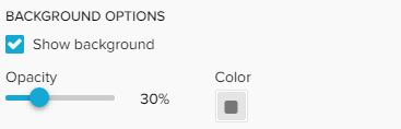
Background: With a checkbox a background for the component can be applied. The color and opacity can be adjusted in the appearing settings.
Shape type: You can choose between hexagon, circle and square representations of your activity nodes.
Type your desired title into the text field.
When a title is set, its formatting option will be shown directly as the next settings and font, size, color and alignment can be defined.
Activate the "Show Border" checkbox to surround your explorer with a border.
You can specify the thickness, style, color and opacity of the borderline.
Set a background color for your explorer!
Activate the "Show background" checkbox, select a color and adjust the opacity.
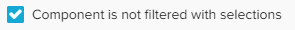
If you don't want your explorer to be affected by any external selection (except for internal component filter and Process Explorer selections), activate the "Component is not filtered with selections" checkbox.