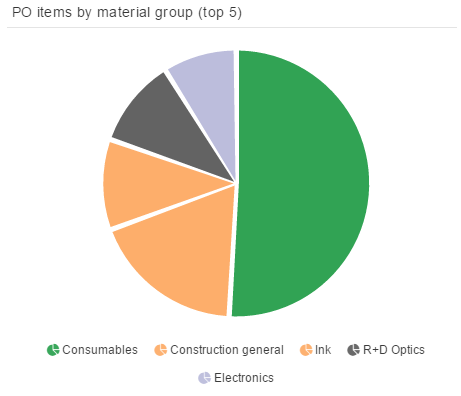
A Pie Chart illustrates numerical proportions of the underlying data in the well-known circle.
The dimensions can be columns or aggregations and the KPIs are typically frequencies or distributions.
You can find all available configuration options in the following chapters.