The following options are available in the General Options section:
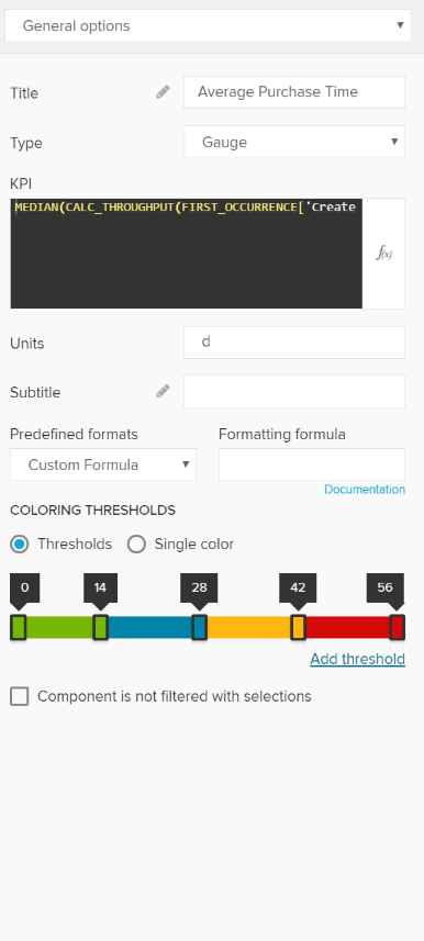
The title will appear above the Single KPI area in your analysis sheet.
Please specify your desired title into the text field.

Next to the text field, a small pencil icon ( ) appears.
This will open the area options, or display the title configuration directly under the text field:
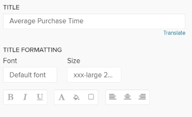
You may edit your font, its size ,text highlighting, colors (font-, background - and border color) and your text orientation.
The Single KPI comes with 4 different types, that can be compared to skins.

Choose any type from the dropdown list.
Let's examine the types a little further:
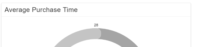
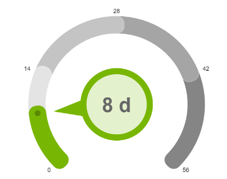
Gauge is the default type of a Single KPI.
Your component will be displayed like a tachometer:
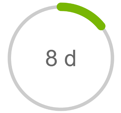
Your KPI will be aggregated to a circle line:
Your component will be displayed as a vertical bar.

Your component will be displayed as a single number.