The following settings are available for the Throughput Time Search:
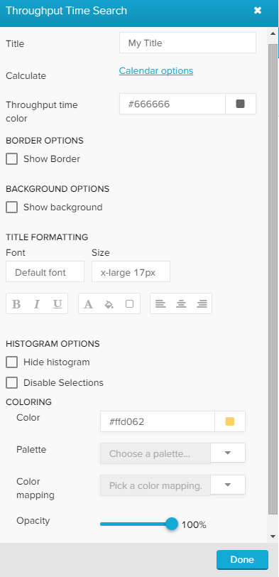
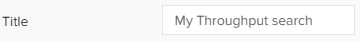
Type your desired title into the text field.
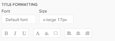
When a title is set, its formatting option will be shown. Font, size, color and alignment can be defined.
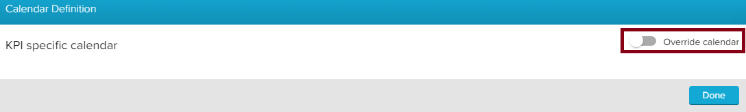
Click on Calendar options, if you wish to limit your Throughput Time search to specific times (e.g. working hours, Mo-Fr 8-18h).
If now specification has yet been made, activate the KPI specific calendar with Override calendar.
The following options will show up:
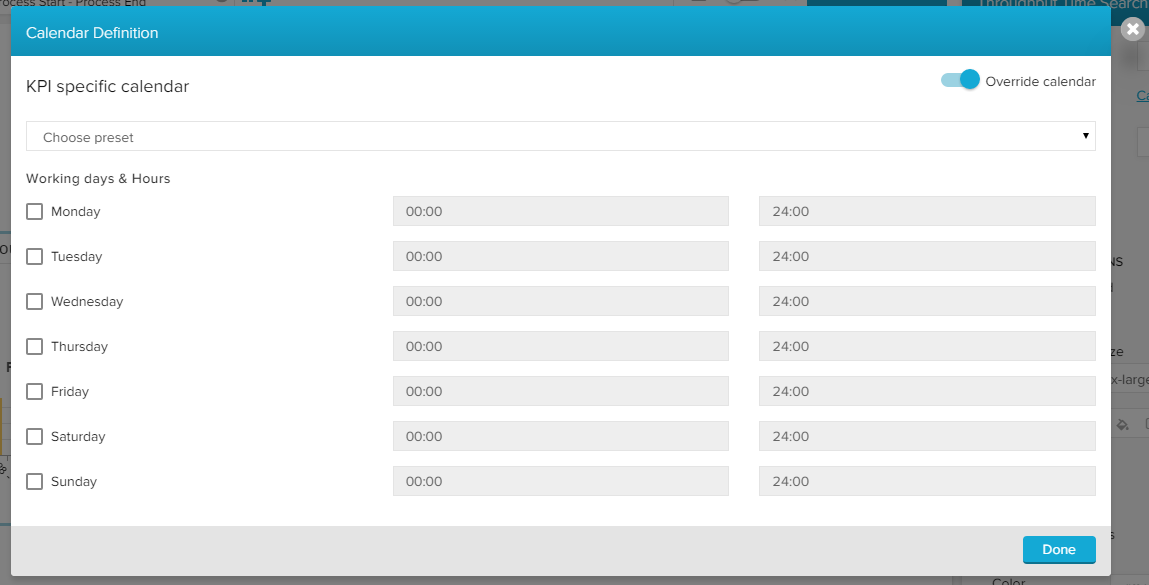
Activate the days and enter the times, that you wish to limit your Throughput Time search on.
Celonis 4.2 has already some presets included, which might be useful.
Click the Choose preset dropdown menu and choose any option:
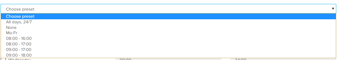
To reset all selections, choose None.
Confirm your calendar with  .
.
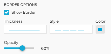
Activate the Show Border checkbox to surround your explorer with a border.
You can specify the thickness, style, color and opacity of the borderline.
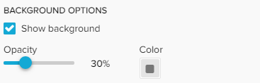
Set a background color for your explorer!
Activate the "Show background" checkbox, select a color and adjust the opacity.
There are several possibilities to color your histogram.
If you wish to color all bars in the same color, pick a color in the Color field.
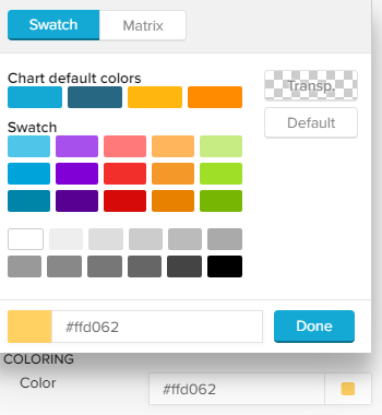
You can use a palette to color your bars in different colors.
Celonis 4.2 comes with a set of pre-defined palettes, which can be accessed with the small ![]() icon.
icon.
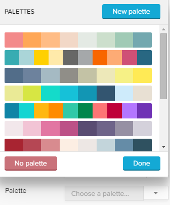
Choose any palette and click on Done, or choose New palette to define a custom palette.
The palette editor will show up:
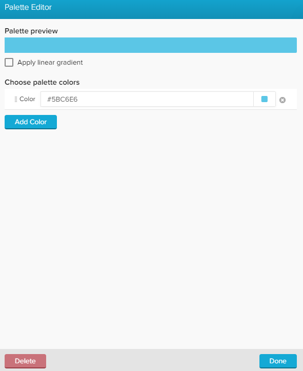
Click on  to add up to 20 colors!
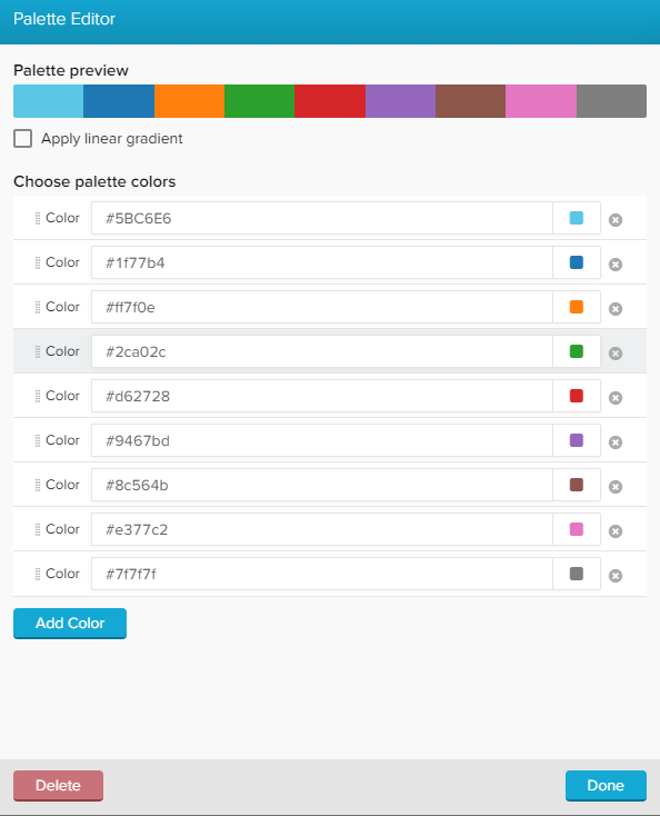
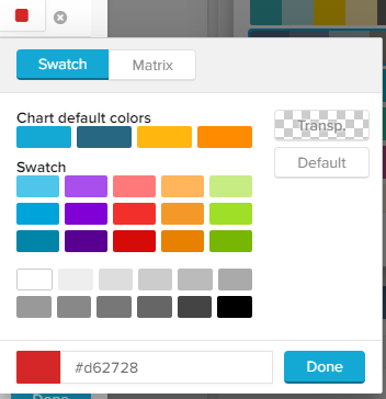
You can edit each color by clicking on the small colored square next to each color:
You can furthermore add a linear gradient to your palette. This will split your selected colors up into 20 gradient colors, which fade linear between two colors.
Don't forget to apply your palette with .
Your new palette has now been added, and can be edited with the small icon next to your custom palette:
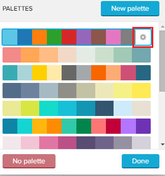
While editing a palette, you can delete it by clicking on  .
.
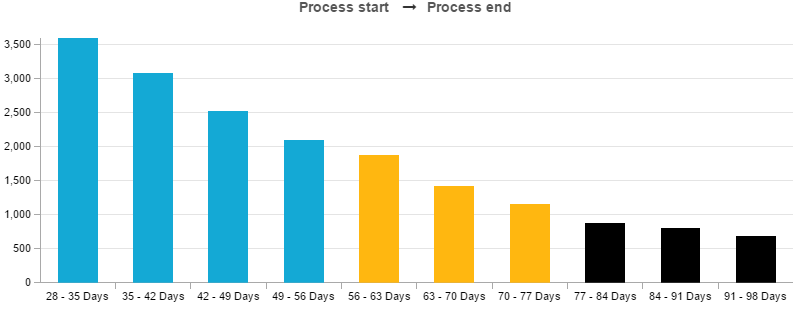
This method allows bar coloring according to different criteria.
For example, critical values can be highlited with a different color.
Click on the small ![]() icon to get started!
icon to get started!
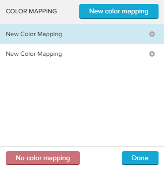
To add a new color mapping, click on  in the upper right corner.
The following color mapping editor will open:
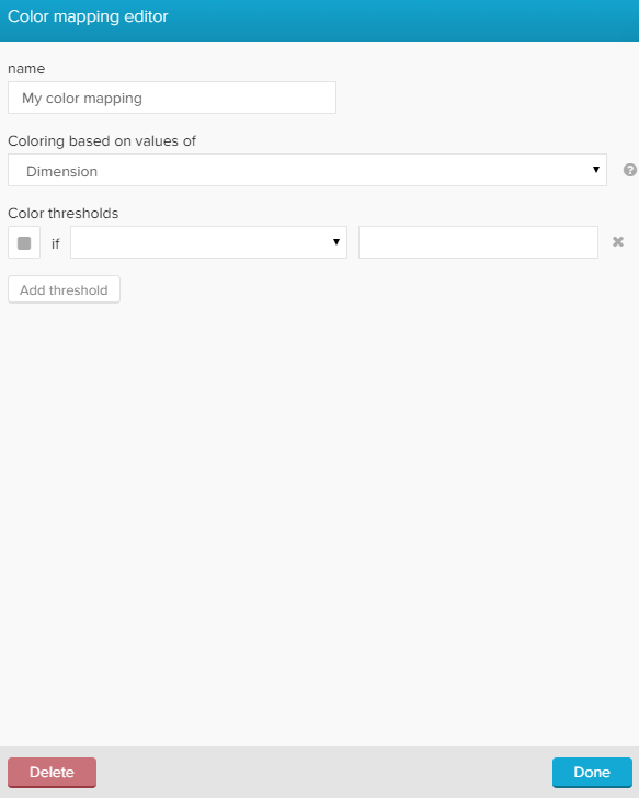
First, let's give our new color mapping a title in the upper text-field.
You can furthermore choose coloring based on values of Dimensions or Series (which is selected by default).
For the Throughput Time search, we strongly recommend to apply colors based on Series, as dimensions are aggregated on the x-axis, and may change according to further selections.
Series allows you to define certain areas on your y-axis (number of cases) to be colored differently.
Therefore, we need to define color thresholds.
For each threshold we can specify a comparison function as well as the actual threshold value.
Let's examine the following example:
We want to color all process aggregations which occur at least 2000 times for a throughput time intervall blue, all bars with a series between 1000 and 2000 yellow, and all other aggregations (<1000) black.
The following threshold settings need to be made:
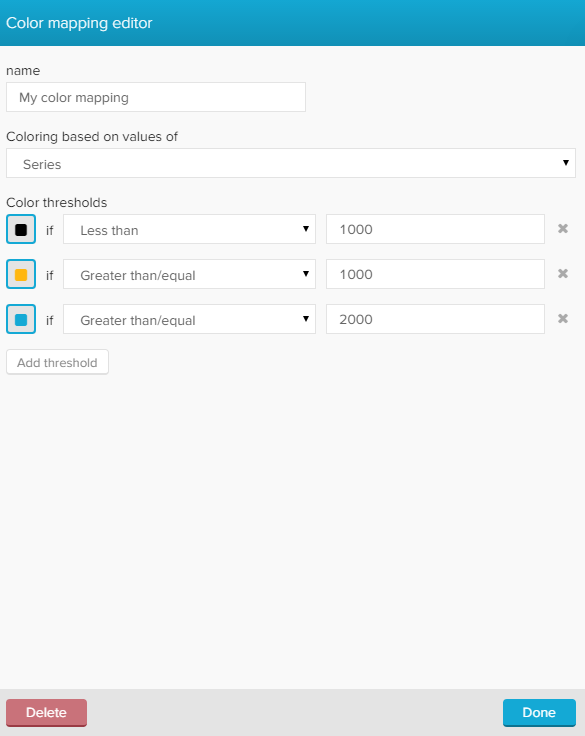
Sorting sequence
Celonis 4.2 prioritizes color threshold settings which have been added recently.
To prevent any coloring overlaps, we strongly recommend to start with the lowest number of cases.
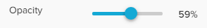
With the opacity slide control, you can adjust the opacity of the bars in your histogramm.
By default, 100% is selected.