Versions Compared

Key

  • This line was added.
  • This line was removed.
  • Formatting was changed.

The General options include the most basic configuration operations for the initialization of the chart, as well as some basic layout options.


Image RemovedImage Added

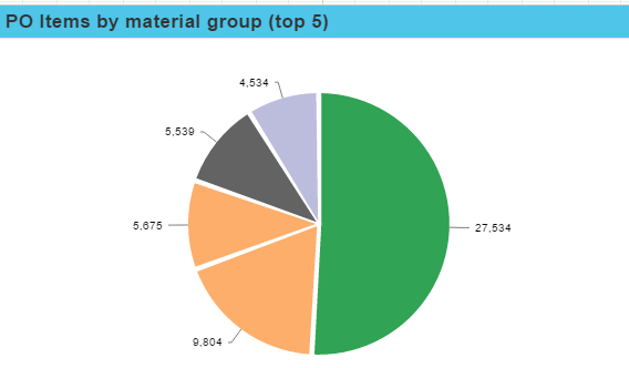
This is a screenshot of the general options for a pie chart.


The general options offer the following options:


Expand
titleTitle


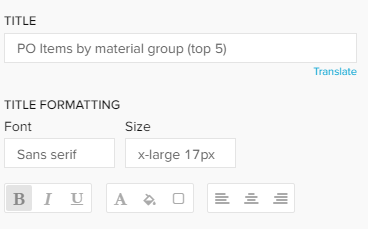
The title will appear above your component in the analysis sheet.


Please specify your desired title into the text field.


Next to the text field, a small pencil icon () appears.

This will either open the area options, or display the title configuration directly under the text field:

You may edit your font, its size ,text highlighting, colors (font-, background - and border color) and your text orientation.


Expand
titleComponent type


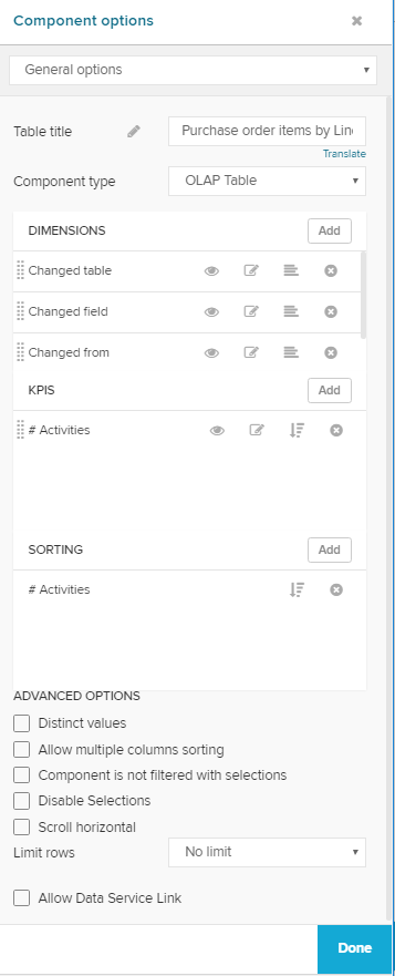
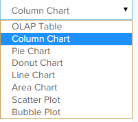
As all Charts And Tables require Dimensions & KPIs, you can most likely swith between components without altering your dimensions or KPIs.

The list of available components can be opened with this drop-down menu:


Note
titlePlease Note

This feature requires similar configuration patterns across the component.

For this reason, it is not available for the following components:


Expand
titleDimensions / KPIs


Use the Formula Editor to add dimensions and KPIs.

If you are not familiar with dimensions or KPIs, we strongly recommend to read the chapter Dimensions & KPIs.


Expand
titleSorting


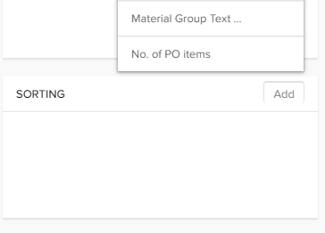
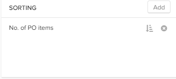
You can sort your component according to any dimension / KPI that has been created for this component.


Click on the button in the upper right corner of the sorting area to define a new sorting rule.

All dimensions and KPIs will show up. Click on any of those to define a new sorting rule.


The names are sourced in the title of the dimension or the KPI, you can not edit titles in the sorting area.

Tip
titleMultiple Sorting

You can add as many sorting rules as you like.

The sorting rules are applied in a descending order, the sorting rule that is listed on top of all rules is the first sorting rule to be considered.

You can change the order of the sorting rules with drag&drop.


For each sorting rule, you can choose between ascending / descending order.

By default, an ascending sorting rule is applied.

Click on the small icon () next to the title to change it.


To delete an existing sorting rule, click on the small cross next to the title ().


Expand
titleAdvanced Options


This is a list of all advanced options.

Not all of them might be available in your chart.


Expand
titleDistinct values

If you activate this option, the dimensions are selected distinct.

In our purchase material order this might be useful if you wish to display each material only once, without adding a KPI.

Expand
titleAllow multiple columns sorting

Not only an Analyst, but also a Viewer might want to apply sorting rules.

This is especially useful in OLAP Tables.

If you check this option, Viewer can apply as many sorting rules as they like (for their session, these rules will not be saved to the component).

If you deactivate this option, Viewer can only apply one sorting rule (for one column).

Expand
titleComponent is not filtered with selections

If you don't want your component to be affected by any external selection, activate the Component is not filtered with selections checkbox.

Expand
titleDisable Selections

By default, Selections can be applied by any viewer by choosing columns from the OLAP-Table. If you activate this option, this will no longer be possible for this component.

Expand
titleScroll horizontal

Use this option if you wish to display a horizontal scroll bar. When activated, it will be displayed if the content of the table exceeds the available space in the assigned component area.

Expand
titleLegend

Activate this option to show the chart's legend.

To edit the legend, click on the small icon.

This will open the area options.

Expand
titleVertical

If a vertical checkbox is availble, you can turn the whole chart by 90 degrees.

The chart bars will be displayed in a vertical direction, instead of a horizontal direction.

Expand
titleLimit rows

Depending on your data model and your selected dimensions / KPIs, components might include too many entries, which decreases the legibility. If you wish to limit the rows (for example, only display the top 150 entries in a table or the top 5 entries for a chart), you can use this option.


First, we need to activate the limiter with the drop-down menu. Choose Limit:


Now, enter a number in the Number of Rows / Elements shown field.


Tip
titleSorting

This option only displays the upper rows. However, you can use Sorting rules (as described above) to bring up lower rows in the upper rows by altering the sorting rules.

Expand
titleShow tooltips

Tooltips show details about the chart entry by hovering it in your chart area.

These include the relative percentage of the entry (calculated upon the displayed entries), your selected dimension attribute and (absolute) KPI value.

Image Removed

Image Removed 


Don't forget to save your settings with .