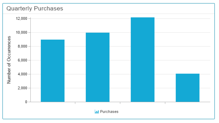
A Histogram visualizes the distribution of a certain dimension, and is very similar to the well known Column Chart.
However, you can group your dimension into data sections, to (for example) filter them for quarterly results.
Configuration
The following configuration tabs are available in the component settings:
Please notice the additional Advanced Settings in the General Component Settings:
To group your Dimension, you can make use of 3 Partition rules:
| Expand | ||
|---|---|---|
| ||
The chart will display the given number (in the Count field) of groups in the Histogramm, and divide/round your dimension area accordingly. |
| Expand | ||
|---|---|---|
| ||
Each group area will have the given width (in the Count field). Please make sure to enter a value according to your selected dimension format. |
| Expand | ||
|---|---|---|
| ||
Explicit boundaries give you the opportunity to define each area manually. They don't necessarily need to have the same size. |